5 Foolproof Colour Palettes That Always Work in Homes
Why Choosing the Right Colour Palette Matters
Picking a colour palette is one of the most important (and overwhelming) decisions when decorating your home. The right colours can make a space feel calm, cohesive, and timeless, while the wrong ones can throw off the entire design.
But here’s the good news: you don’t need to be an expert to get it right. Some colour combinations are so versatile and well-balanced that they work every single time, whether you’re redecorating a flat or designing your forever home.
In this blog, we’ll explore 5 foolproof colour palettes that interior designers swear by. These schemes are grounded in classic design principles but leave plenty of room for your personal style. Whether you lean neutral, bold, or somewhere in between, there’s a palette here that will feel just right.
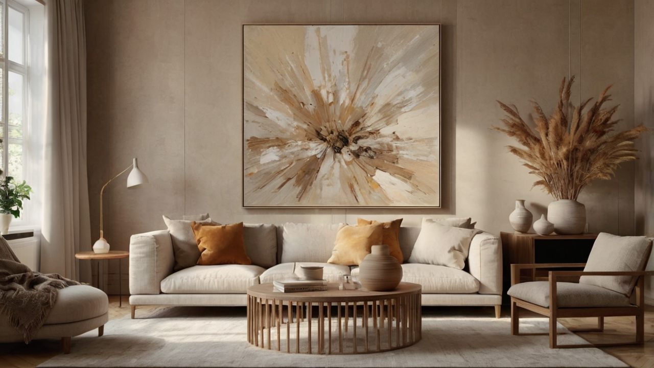
1. Soft Neutrals: Beige, White, Taupe, and Greige
This palette is the foundation of timeless interior design. Soft neutrals like beige, ivory, and greige (a mix of grey and beige) offer a serene, versatile base that works in almost any room. They allow texture, materials, and decor to shine, making them perfect for minimalist, modern, and Scandinavian-inspired spaces.
To make neutrals feel warm rather than clinical, layer different shades and textures. Think: a taupe linen sofa against a creamy wall, with nubby boucle cushions, a sisal rug, and pale oak furniture. Add visual depth by mixing warm whites with cooler greys for a balanced, lived-in feel.
Neutrals don’t have to mean boring. Introduce interest with matte black fixtures, brass accents, and woven baskets. A neutral backdrop also lets you swap out accessories seasonally, burnt orange in autumn, olive green in spring without having to redecorate the whole room.

2. Navy and White: Classic with a Modern Twist
Navy and white is crisp, confident, and endlessly elegant. This high-contrast palette is beloved in coastal and classic interiors, but it also feels modern when styled with sleek finishes and simple silhouettes.
Navy can be bold, so consider using it on a feature wall, cabinetry, or sofa while keeping walls and larger surfaces in white or off-white. The dark hue anchors the room, while white opens it up, creating balance.
This palette pairs well with brass, marble, and natural wood. Add in striped patterns, indigo textiles, or rattan furniture for a coastal vibe, or go urban with leather and concrete for a moodier take.

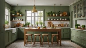
3. Sage Green, Cream, and Warm Wood
Sage green is the darling of modern interior colour trends and for good reason. It’s soft, soothing, and pairs beautifully with creams and warm-toned woods. Together, these colours create a calming, organic look that feels both fresh and timeless.
Use sage green on cabinetry, walls, or soft furnishings like cushions and throws. Creamy whites prevent the green from feeling too cool, while honey-toned or walnut woods add natural warmth.
This palette is perfect for biophilic interiors, farmhouse kitchens, or tranquil bedrooms. Finish with botanical prints, linen textiles, and handmade ceramics for a cohesive, nature-inspired feel.
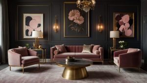
4. Charcoal, Dusty Rose, and Brass
If you love a more dramatic, romantic look, this palette delivers. Charcoal adds depth and sophistication, while dusty rose brings a touch of softness and femininity. Brass finishes tie it all together with a subtle glow.
Use charcoal on walls or upholstery to ground the space. Layer in dusty rose with soft furnishings like cushions, curtains, or an accent chair. Keep things balanced by using pale neutrals (like soft grey or ivory) as a backdrop.
This combination works beautifully in bedrooms, dressing rooms, or statement living spaces. Think plush velvets, curved furniture, and moody lighting to elevate the scheme.
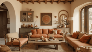
5. Terracotta, Olive Green, and Cream
This earthy, Mediterranean-inspired palette brings instant warmth and character. Terracotta adds energy and richness, while olive green introduces an organic calm. Cream acts as the unifying neutral that keeps it all grounded.
These colours work particularly well in sunlit rooms, kitchens, or boho living spaces. Use terracotta in textiles, tiles, or painted accents. Olive green pairs beautifully in cabinetry or plant styling. Together, they evoke natural materials and timeless charm.
Balance boldness with plenty of cream or off-whiteon walls, flooring, or larger furniture to prevent the space from feeling heavy. Add rustic elements like terracotta pots, linen fabrics, and antique brass for cohesion.
Start With the Mood You Want to Create
Each of these palettes offers a different mood, relaxed, bold, romantic, earthy. When choosing the right one for your space, start by thinking about how you want the room to feel.
And remember: colour is personal. These schemes are a jumping-off point, feel free to tweak shades, mix materials, and layer patterns that speak to you.
With the right palette, your home can feel pulled together, harmonious, and full of personality.
Post a Comment
You must be logged in to post a comment.